



Website responsiveness: how to test the mobile experience

19
September
2020
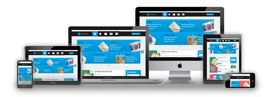
A responsive website rearranges its blocks to fit the screen and works equally well on a phone, tablet and desktop. Test it in two steps: automatically with Lighthouse and PageSpeed Insights, then by hand on real phones.
In short
- Google indexes sites by their mobile version, so content hidden on phones counts for less in search.
- Google retired the Mobile-Friendly Test in December 2023; Lighthouse and PageSpeed Insights replace it.
- Core Web Vitals in 2026: LCP (loading), INP (responsiveness), CLS (layout stability).
- Manual checks are essential: the phone keyboard, forms, menus, tables.
- Finish sign-off by sending a real enquiry from a phone.
What is website responsiveness?
Responsive layouts adapt the arrangement of elements to the available screen space. The same URL and the same HTML show different layouts: columns on a desktop, stacked blocks on a phone. A separate mobile site on a subdomain such as m.example.com is rare today because it is harder to maintain.
Test the complete user journey: reading, navigation, product selection and form submission.
Why does responsiveness matter for SEO and enquiries?
Google has moved all sites to mobile-first indexing: what a smartphone sees is what gets indexed. If text, links or structured data are missing on mobile, the page counts for less. Besides, most visitors to small business websites arrive from a phone. An awkward form on a narrow screen means lost enquiries.
How do you test responsiveness online?
Google retired the Mobile-Friendly Test and its API in December 2023. Use Lighthouse for automated diagnostics and PageSpeed Insights for performance analysis. Supplement reports with manual accessibility and journey tests.
- PageSpeed Insights: paste the page URL and open the Mobile tab. It separates lab measurements from real-user data when available.
- Lighthouse: built into Chrome (DevTools → Lighthouse). It flags font sizes, tap targets and viewport issues.
- Chrome DevTools device mode (Ctrl+Shift+M): scroll the page at 360, 390, 414 and 768 pixels wide.
- Search Console: the Core Web Vitals report shows real Chrome data for the whole site.
Core Web Vitals assess loading, responsiveness and visual stability. In March 2024, INP replaced FID as the responsiveness metric. These measures complement responsive layout testing.
What should you check manually?
- Text remains readable when zoomed and elements do not overlap.
- Menus, buttons and fields work on a narrow screen, and tap targets fit a finger.
- Long words, tables and images fit their areas, with no sideways scrolling.
- The phone keyboard does not obscure essential fields or confirmations.
- Forms handle invalid input and navigation works with a keyboard.
- Pop-ups and the cookie banner do not cover the menu or the enquiry button.
Test several window sizes and real devices, at least one Android phone and one iPhone. Browser emulation helps locate problems, but touch behaviour and the on-screen keyboard need separate checks.
How do you record and retest issues?
For each defect, record the page, screen width, device and reproduction steps. A screenshot saves the developer time. After a fix, repeat the journey on narrow and wide screens. Finish acceptance testing with a successful enquiry or order.
What if the site is not responsive at all?
If an old site is built on a fixed width, patching usually does not help. A redesign with a responsive layout is more practical; we keep the structure and URLs so rankings are not lost. If the layout mostly works and only some blocks break, website support is enough: we go through the defect list and fix it by priority.
Frequently asked questions
How can I test a website for responsiveness for free?
Run PageSpeed Insights or Lighthouse in Chrome, then switch on device mode in DevTools and scroll the page at 360–414 pixels wide. Finish on your own phone.
What is the difference between a responsive site and a mobile version?
A responsive site uses one URL and rearranges blocks for the screen. A mobile version is a separate site or subdomain that has to be maintained in parallel.
Does responsiveness affect Google rankings?
Yes, indirectly. Google indexes the mobile version, and page experience and Core Web Vitals are part of its quality assessment. A site that is awkward on phones loses both rankings and enquiries.
Why does the Mobile-Friendly Test no longer work?
Google shut down the tool and its API in December 2023. Use Lighthouse, PageSpeed Insights and Search Console reports instead.
How long does it take to make an old site responsive?
It depends on how many templates the site has. With a fixed-width layout, a redesign is usually the better deal. We give a timeline after auditing the pages.
Is your site hard to use on a phone? Send us the URL, and we will check the mobile version and propose a fix list or a redesign plan.
Sources
Contact us
We will answer all your questions.
 DUNS Number: 68-606-2061
 NCAGE Number: A3G3J






 "INNOVA CONSULTING GROUP"


Comments
Write comment